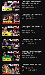
The thumbnail originally said 'PSICK', but the letters P, S, and I were cleverly covered to make it look like 'FUCK.'
All other thumbnails have 'PSICK' written on them, but only Jang Wonyoung's stands out so obviously. It's surprising that it hasn't stirred controversy yet. Considering it's a concept conducted in English, is it really believable that they didn't know or it was a mistake, covering the P to make it look like an F?
Other thumbnails:
International fans' reactions:
-There must have been many people who stayed quiet because they didn't want to create unnecessary controversy.
-If that's intentional, then they're really thoughtless.
-Youtubers I watch usually put a lot of effort into making thumbnails. It's hard to believe that something like that would go unnoticed on a Youtube channel that big.
-If only one out of 96 thumbnails is like that, then it seems intentional.
-Even if it wasn't intentional, if people keep pointing it out, they should fix it.
-They've been doing this kind of thing all along... This controversy is probably just the tip of the iceberg...
-I don't think they aimed for it, it just seems thoughtless to me.
-What kind of thoughtlessness is that? ㅋㅋㅋ Get your act together. Does that thumbnail look normal to you?
-Fix it.
-Even if it wasn't intentional, it's a poorly made thumbnail. Fixing it is the right thing to do.
-I didn't think they were just trying to flaunt Jang Won-young's face... But yeah, they should fix it.
-For them to not even know what 'fxck' means...? It's such a basic swear word that it's embarrassing to explain. I recommend looking it up in a dictionary.
-All the other thumbnails are fine, but only Jang Wonyoung's is weird. It's definitely strange, but to call it intentional...? It's a reach
-Disgusting.
-It doesn't seem intentional, just move her picture slightly and fix it.
-Wow.... They could've just placed her picture all the way to the left like the others.
-I'm a design major. There's an empty space next to Wonyoung's face on the left. If it wasn't intentional, they would have placed the title further to the left. There's no need for such ambiguous right alignment. The important thing is whether 'P' is fully visible or not. Despite there being empty space, they deliberately placed the text in a way that 'P' is not fully visible, making it look like 'F' instead of 'P' --> This is intentional. Especially since in other videos, the logos are fully visible, it's just weird. If they didn't intend to do that and just wanted to have a larger picture of Wonyoung in the thumbnail, they should put it on the left and placed the logo on the right. That's how you maintain consistency with the thumbnails uploaded so far. But they didn't do that. They deliberately made it different.
-The title isn't even clearly visible in the thumbnail. And they say it's not intentional? If they wanted it to be visible, it could easily be made visible, or at least 'I' could be visible. There's no such thing as unintentional design.


